E-Learning / SEO Education
Designing a Learning Platform That Actually Teaches
How structured information architecture transforms overwhelming SEO education into confident mastery
- Client
- SEO Degree
- Timeline
- 8 weeks
- Role
- Lead Designer & UX Strategist
- Industry
- E-Learning / SEO Education
Overview
The SEO education space has a fundamental problem. There's no shortage of information. YouTube alone has millions of SEO tutorials. The real challenge: finding structured, authoritative content that builds knowledge systematically instead of leaving learners more confused than when they started.
SEO Degree needed a platform that could cut through the noise. Not another content dump, but a genuine learning experience that takes someone from zero to competent. The goal was to design an interface that makes complex concepts accessible without dumbing them down.
Most SEO courses fail because they treat the subject like a collection of tricks rather than an interconnected discipline. The platform needed to show learners the connections between concepts while keeping each lesson digestible.
The Challenge
The SEO education market is saturated with conflicting advice. One expert says one thing, another contradicts it entirely. For beginners, this creates analysis paralysis. For the platform, it creates a positioning challenge: how do you establish authority in a space where everyone claims to have the "real" answers?
The deeper UX challenge: learning design. Most educational platforms treat content like products on shelves. Dump everything out, let users browse. This works for shopping. It fails for learning. Without clear progression, learners bounce between topics, never building the foundational understanding that makes advanced concepts click.
The visual challenge was equally complex. SEO is inherently abstract. Keywords, rankings, algorithms. None of it is tangible. The design needed to make invisible concepts visible without resorting to the clichéd magnifying glass and gear icons that plague the industry.
Key Pain Points
- Overwhelming amount of conflicting SEO advice online
- No clear learning progression in most SEO resources
- Abstract concepts difficult to visualize and understand
- Students unable to distinguish credible sources from outdated information
- Lack of structured curriculum that builds systematically
- Most platforms prioritize content quantity over learning outcomes
Industry Context
The e-learning market has exploded to $325 billion globally, with digital marketing education being one of the fastest-growing segments. SEO courses specifically dominate the digital marketing education space, driven by a 230,000-person skills gap in the US alone.
But growth has created noise. Anyone can publish a course. The MOOC market's 39% annual growth rate means more options, not necessarily better options. Students increasingly report frustration with course quality and completion rates remain notoriously low across the industry.
The opportunity lies in differentiation through design. While competitors focus on cramming more content into their platforms, the winning approach focuses on learning outcomes. 91% of marketers report that SEO enhanced their business performance in 2024. The demand is real. The question is whether the education can match it.
$325B
Global e-learning market
230K
Digital marketing skills gap (US)
91%
Marketers say SEO works
39%
MOOC market annual growth
The Approach
The design process started with learning science, not aesthetics. Before touching Figma, I mapped out how people actually learn complex skills. The key insight: expertise isn't accumulated facts. It's connected understanding. The platform needed to make those connections visible.
From there, the work focused on reducing cognitive load. Every screen asked one question: what's the single most important thing a student needs to understand right now? Everything else got pushed to progressive disclosure layers.
Learning Path Mapping
Analyzed how SEO concepts interconnect and designed a curriculum structure that builds knowledge in the right sequence.
Cognitive Load Analysis
Identified where students typically get overwhelmed and designed interface patterns that present information at digestible pace.
Visual Language Development
Created a design system that makes abstract SEO concepts tangible through consistent iconography and data visualization.
Interactive Prototype
Built high-fidelity prototypes to test learning flow assumptions before development commitment.
The Solution
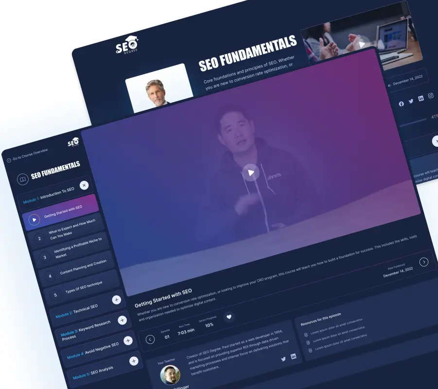
The final design centers on a clear visual hierarchy that guides students through content without overwhelming them. The dashboard immediately shows progress and next steps. No decision fatigue about what to study next.
Course modules use a card-based system that reveals complexity gradually. Students see the big picture first, then drill into details when ready. This layered approach respects both beginners who need hand-holding and intermediate learners who want to skip ahead.
The typography and spacing create breathing room that's rare in educational platforms. Most competitors cram screens with content, creating visual anxiety. This platform lets concepts breathe, improving comprehension and reducing fatigue during longer study sessions.
Progressive Curriculum Design
Modules unlock based on mastery, ensuring students build foundational knowledge before tackling advanced topics.
Visual Concept Mapping
Interactive diagrams show how SEO concepts connect, helping students see the discipline as a system rather than isolated tactics.
Clean Learning Interface
Generous white space and focused layouts reduce cognitive load, letting students concentrate on content rather than navigation.
Progress Visualization
Clear progress indicators and achievement milestones maintain motivation through the learning journey.
The Result
The design prototype demonstrates how educational platforms can prioritize learning outcomes over content volume. The clean, focused interface stands in stark contrast to the cluttered dashboards that dominate the e-learning space.
By treating the learning experience as a designed journey rather than a content repository, the platform creates conditions for genuine skill development. Students can see exactly where they are, where they're going, and why each lesson matters.
The prototype serves as a blueprint for how SEO education should work: structured, visual, and respectful of the student's cognitive limits.
Reflection
This project reinforced that educational design is fundamentally different from marketing design. The goal isn't to impress on first glance. It's to support sustained attention over weeks or months of learning.
The biggest lesson: restraint matters more in education than almost any other context. Every additional element, every visual flourish, every "helpful" feature adds cognitive load. The best educational interfaces feel almost invisible. They get out of the way and let learning happen.
Working on SEO education also highlighted the gap between industry knowledge and teaching ability. Many SEO experts struggle to structure their knowledge for beginners because expertise makes you forget what confusion feels like. Good educational design bridges that gap.