E-Learning / SEO Education
Making SEO Course Discovery Actually Useful
Designing a filterable library that helps professionals find the right SEO training without the research headache
- Client
- SEO Frameworks
- Timeline
- 6 weeks
- Role
- Lead Designer & Developer
- Industry
- E-Learning / SEO Education
Overview
Finding the right SEO course shouldn't require weeks of research. But that's exactly what professionals face. Hundreds of courses, conflicting reviews, unclear curricula. Most people give up and pick something based on marketing rather than fit.
SEO Frameworks needed to solve the discovery problem. Not another course platform, but a curated library with honest reviews, meaningful comparisons, and filters that actually help narrow down options. Think Wirecutter for SEO education.
The challenge was creating a system that could handle dozens of courses while remaining scannable and useful. Not a wall of options, but a tool that genuinely helps professionals make informed decisions.
The Challenge
Course comparison is inherently complex. Price, duration, instructor credibility, curriculum depth, learning format, community support. Each course has dozens of variables, and different professionals prioritize different factors.
Most review sites fail because they try to rank everything on a single scale. But SEO courses serve different audiences. A beginner needs different things than an agency owner scaling a team. The platform needed filtering that respects these differences.
The business model added another layer: affiliate revenue. The design needed to drive clicks without feeling like a sales pitch. Credibility depends on appearing objective, even when every outbound link generates commission.
Key Pain Points
- No trusted source for comprehensive SEO course reviews
- Existing review sites feel biased toward highest-commission courses
- Difficult to compare courses with different structures and formats
- Course marketing often misrepresents actual content and difficulty
- No way to filter based on specific learning goals or experience level
- Reviews rarely updated as courses change over time
Industry Context
The digital marketing education market is projected to reach $3 billion by 2032, with SEO training being the dominant segment. But growth has created a trust problem. Affiliate marketing incentivizes promotion over honesty.
Professionals increasingly rely on peer recommendations over official reviews. Reddit, Twitter, and Slack communities have become de facto course discovery platforms. This shift reveals a gap: there's demand for curated, honest evaluation that most review sites fail to provide.
The opportunity was positioning SEO Frameworks as the trustworthy alternative. A platform that professionals recommend because it actually helped them make better decisions, not because it had the most aggressive marketing.
$3B
Digital marketing education by 2032
12.4%
Annual market growth rate
59%
Mid-level SEO roles in demand
21%
AI skills in SEO job posts
The Approach
The design started with filter architecture. What criteria actually matter when choosing an SEO course? Price and duration are obvious. But experience level, learning style preference, and specific skill focus proved equally important.
The goal was making comparison effortless. Users should be able to narrow from fifty courses to three in under a minute. That required designing filters that are both powerful and intuitive.
Taxonomy Development
Created a comprehensive classification system for SEO courses covering format, difficulty, specialization, and teaching methodology.
Filter UX Design
Designed filter interactions that feel lightweight while enabling complex multi-criteria searches.
Review Template System
Developed consistent review frameworks that enable meaningful course-to-course comparison.
Comparison Tool
Built side-by-side comparison functionality for users evaluating final candidates.
The Solution
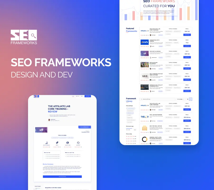
The library design uses a card-based grid that balances information density with scannability. Each card shows the essential decision factors at a glance: price, duration, difficulty, primary focus area. Users can evaluate options without clicking into individual pages.
The filter system sits prominently but doesn't overwhelm. Active filters remain visible, making it clear how the current view is constrained. Removing filters is as easy as adding them, encouraging exploration.
Individual course pages follow a consistent template that makes comparison natural. The same information appears in the same places across all reviews. Users develop familiarity with the format, speeding up evaluation.
Multi-Criteria Filtering
Filter by price, duration, difficulty, format, specialization, and more without losing context of overall options.
Scannable Course Cards
Card design surfaces key decision factors immediately, reducing clicks needed to evaluate options.
Side-by-Side Comparison
Select courses to compare in a dedicated view that highlights differences across evaluation criteria.
Consistent Review Format
Standardized review template ensures all courses are evaluated on the same dimensions.
The Result
The design transforms course discovery from a research project into a simple filtering exercise. Professionals can arrive with vague requirements and leave with a shortlist of genuinely relevant options.
The consistent review format builds trust through transparency. Users see that every course is evaluated fairly, using the same criteria. This objectivity differentiates the platform from affiliate-driven review sites that push whatever pays best.
The comparison tool particularly resonates with methodical decision-makers who want to see options side by side before committing.
Reflection
This project demonstrated that information architecture is the foundation of good UX. Filtering and comparison are fundamentally about organizing information in ways that match how people actually make decisions.
The affiliate business model created interesting constraints. The design needed to drive conversions without sacrificing credibility. The solution was radical transparency: showing the same information for every course, including less flattering details, builds the trust that ultimately drives clicks.
The library model also revealed how much people appreciate curation over comprehensiveness. Users didn't want every course ever created. They wanted someone trustworthy to narrow the field and give them honest evaluations of the best options.