Real Estate
Redesigning Real Estate for the Luxury Buyer
How strategic design elevated a Century 21 franchise above commodity competition
- Client
- Century 21 Pura Vida
- Timeline
- 10 weeks
- Role
- Lead Designer & UX Strategist
- Industry
- Real Estate
Overview
Real estate websites have a sameness problem. Property search, agent listings, contact forms. The template is so established that most sites blur together. For Century 21 Pura Vida, operating in a competitive luxury market, blending in meant losing.
The redesign needed to accomplish two things: establish premium positioning that matches the properties being sold, and create a property discovery experience that actually helps buyers rather than just listing inventory.
The client had strong properties and experienced agents. What they lacked was a digital presence that communicated that quality. The previous site felt generic, a template that could have belonged to any real estate company anywhere.
The Challenge
Real estate websites face a fundamental tension. They need to display large inventories while maintaining visual appeal. Most sites resolve this by making listings the entire focus, resulting in glorified property databases that all look identical.
The luxury segment adds pressure. High-net-worth buyers expect sophistication. They're comparing the site experience to luxury brands in other categories. A clunky property search or pixelated hero image destroys premium perception instantly.
The Century 21 brand created additional constraints. Franchise guidelines required certain elements while the local market demanded differentiation from other Century 21 offices. The design needed to honor the parent brand while establishing distinct positioning.
Key Pain Points
- Previous site indistinguishable from template-based competitors
- Property search felt like a database query rather than discovery experience
- Image quality inconsistent across listings
- Mobile experience essentially unusable for property browsing
- No clear value proposition differentiating from other Century 21 franchises
- Lead capture friction losing potential clients
Industry Context
Real estate websites average a 2% conversion rate, with top performers reaching 5% or higher. The gap between average and excellent is enormous in revenue terms. Each percentage point improvement translates directly to more leads, more showings, more sales.
The industry is also experiencing a mobile-first shift. Buyers increasingly browse properties on phones, yet most real estate sites remain optimized for desktop. Sites that load in 1 second see 3x more conversions than 5-second sites. Speed and mobile usability have become competitive advantages.
Virtual tours and high-quality video have moved from nice-to-have to essential. Listings with video content receive 49% more qualified leads. Buyers expect to explore properties online before scheduling in-person visits.
2%
Average real estate conversion
8.4%
Top performer conversion rate
49%
More leads with video listings
3x
Conversions for fast-loading sites
The Approach
The redesign started with competitive analysis. What were the best real estate sites doing? More importantly, what were the best luxury brand sites doing? The goal was bringing luxury web design sensibilities to real estate rather than just improving within category norms.
Property photography emerged as a critical factor. The same property could feel generic or aspirational depending on how images were presented. The design needed to elevate existing photography through careful cropping, sizing, and contextual presentation.
Competitive Audit
Analyzed both real estate competitors and luxury brands outside the category to identify design opportunities.
User Journey Mapping
Mapped the property buyer journey from initial search through lead submission, identifying friction points and opportunities.
Visual Identity Refinement
Developed a visual language that honors Century 21 brand guidelines while establishing premium local positioning.
Property Experience Design
Reimagined how individual listings present, focusing on immersive imagery and scannable property details.
The Solution
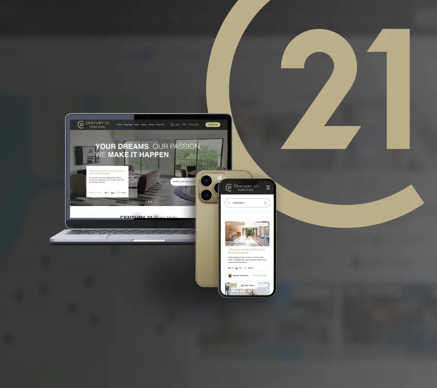
The redesign centers on visual impact. Full-bleed imagery, generous white space, and restrained typography create an experience closer to a luxury magazine than a property database. The site feels curated rather than comprehensive.
Property search was reimagined as discovery rather than querying. Visual filters and map-based exploration replace endless dropdown menus. Users can browse by neighborhood, property type, or price range without feeling like they're filling out a form.
Individual listings got the most attention. Hero images span the full viewport. Photo galleries use thoughtful transitions. Property details are organized in scannable sections that answer buyer questions in logical sequence. The goal: make every listing feel like its own landing page.
Visual-First Search
Map and image-based property discovery replaces form-heavy search interfaces common in real estate.
Immersive Listing Pages
Full-screen imagery and thoughtful information hierarchy make each property feel like a curated presentation.
Mobile-Optimized Experience
Touch-friendly interfaces and fast loading ensure seamless property browsing on smartphones.
Streamlined Lead Capture
Contextual inquiry forms reduce friction, appearing at natural decision points throughout the browsing experience.
The Result
The redesign received recognition from industry experts, including praise from Kevin Geary, a well-known CRO consultant in the WordPress space, as one of the most beautiful real estate web designs he'd seen.
More importantly, the design addressed the core business problem: differentiation in a commoditized market. Century 21 Pura Vida now has a digital presence that matches the quality of properties they represent. The site positions them as the premium choice rather than just another franchise location.
The design demonstrates that real estate websites don't have to look like real estate websites. By borrowing from luxury brand playbooks, the site creates an experience that resonates with high-net-worth buyers.
Reflection
This project reinforced that category conventions are often arbitrary. Real estate sites look similar because designers copy each other, not because those patterns are optimal. Breaking from convention required confidence, but the results justified the risk.
The franchise brand constraints proved more manageable than expected. There's usually more flexibility within brand guidelines than designers assume. The key was understanding which elements were truly non-negotiable versus merely traditional.
Photography quality emerged as the make-or-break factor for real estate sites. Even the best design can't compensate for mediocre listing photos. Future projects in this space would include photography guidelines as a design deliverable.