Hardware / Computing
Engineering an E-commerce Experience for Technical Buyers
Redesigning the mini-PC purchasing journey from confusion to confidence
- Client
- Cirrus7 Computing
- Timeline
- 2017-2019
- Role
- Lead Designer & WooCommerce Development
- Industry
- Hardware / Computing
Overview
Cirrus7 makes fanless mini-PCs for customers who understand exactly what they need: silent operation, compact form factor, and serious computing power. The problem? Their website made even technical buyers second-guess their purchase.
The original e-commerce site had the classic B2B hardware problem: product information buried in dense spec sheets, a configuration process that required a PhD in patience, and checkout flows that leaked conversions at every step.
My job was to transform the site from a technical documentation repository into a shopping experience that matched the quality of the products themselves.
The Challenge
Technical products create a specific UX paradox. Buyers need deep information to make confident decisions, but overwhelming them with specs causes analysis paralysis and cart abandonment.
Cirrus7's configurator options multiplied into thousands of possible SKU combinations. Size, processor, memory, storage, operating system, each choice dependent on others. The previous implementation made customers feel like they were filling out a tax form rather than customizing premium hardware.
The secondary challenge: mobile. 78% of B2B buyers want better mobile experiences, but complex configurators typically collapse into unusability on smaller screens.
Key Pain Points
- Configuration complexity overwhelming potential buyers
- Product specs presented as walls of text
- Mobile experience essentially unusable
- No visual feedback during customization process
- Checkout abandonment from unclear pricing during configuration
- Navigation made product discovery difficult
Industry Context
The mini-PC market has quietly grown to nearly $24 billion globally, driven by remote work adoption, edge computing, and customers who want serious computing power without the noise and bulk of traditional desktops.
But the industry has a UX problem. 85% of B2B buyers say their e-commerce experience should be better. 60% abandon purchases specifically due to slow load speeds. When your product costs several hundred to several thousand dollars, these friction points translate directly to lost revenue.
The companies winning in this space understand that technical buyers still appreciate good design. They don't want dumbed-down interfaces. They want sophisticated tools that respect their intelligence while removing unnecessary friction.
$24B
Global mini-PC market (2024)
85%
B2B buyers want better e-commerce UX
60%
Abandon due to slow load speeds
400%
Conversion lift from intuitive UX
The Approach
The redesign started with the configuration experience. I mapped every product option, dependency, and edge case, then worked backward to find the simplest possible interface that could handle the complexity.
The key insight: technical buyers don't want less information. They want better organized information. The goal wasn't to hide specs but to layer them intelligently, surface what matters most, and let users drill down when they want depth.
Configuration Mapping
Documented every product variant, option dependency, and pricing relationship to understand the full complexity before designing solutions.
User Flow Optimization
Redesigned the purchase journey to progressive disclosure: essential choices first, advanced options available but not overwhelming.
Visual Product System
Created product overview templates that present specs clearly without walls of text, using visual hierarchy to guide attention.
Responsive Architecture
Built the configurator mobile-first, ensuring the experience worked on phones before scaling up to desktop.
The Solution
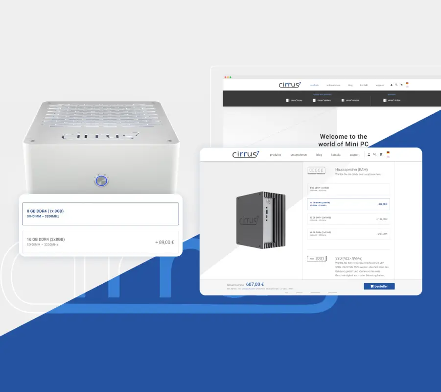
The redesigned product configurator provides real-time visual feedback as customers build their system. Select a processor, watch the price update. Choose additional storage, see compatibility validated instantly. No more submit-and-pray.
Product pages use a modular information architecture. Hero specs visible immediately. Detailed specifications one click away. Comparison tools for buyers evaluating multiple configurations. Each landing page for individual products tells a focused story about that specific machine's strengths.
The WooCommerce implementation required significant custom development to handle the configuration complexity while maintaining performance. Standard plugins couldn't handle the interdependencies between options or provide the real-time pricing updates buyers needed.
Perhaps most importantly: the design has aged well. Built in 2017-2019, the site remains functional and relevant in 2026, proving that solid information architecture and clean visual design outlast trend-chasing.
Intuitive Product Configurator
Real-time validation and pricing as customers customize their system, with clear indication of compatible options.
Layered Specifications
Progressive disclosure of technical details, from hero stats to deep spec sheets, based on user interest.
Product Landing Pages
Individual pages for each product line with focused storytelling and clear value propositions.
Mobile-First Configurator
Complex configuration options that actually work on smartphone screens.
Visual Comparison Tools
Side-by-side product comparison for buyers evaluating multiple configurations.
The Result
The redesigned site transformed the purchase experience from a friction-filled ordeal into a guided journey. Technical buyers could finally configure systems with confidence, understanding exactly what they were getting and why.
The design's longevity speaks for itself. Nearly a decade later, the core architecture and visual approach remain effective. Updates have been evolutionary, not revolutionary, because the foundation was built on solid UX principles rather than design trends.
This project demonstrated that B2B technical products deserve the same design attention as consumer goods. Perhaps more, given the higher stakes and longer consideration cycles involved.
Reflection
Working with hardware configurators taught me the importance of mapping complexity before trying to simplify it. You can't design a good interface for a system you don't fully understand.
The biggest win was proving that technical products don't require ugly websites. The industry assumption that B2B buyers don't care about design is flatly wrong. They care intensely. They just have different criteria for what "good design" means: clarity over decoration, function over flash, respect for their expertise.
Building on WooCommerce meant working within platform constraints while delivering custom functionality. The experience reinforced that the platform matters less than understanding what needs to happen and finding ways to make it happen elegantly.