UnitShift: CSS Unit Conversion Inside DevTools


Every front-end developer knows this drill. You're inspecting an element in Chrome DevTools. The AI-generated code says `margin-top: 48px`. You need that in rem. So you open a new tab, navigate to some calculator website, type 48, divide by 16, copy the result, switch back to your IDE, find the line, paste it, save, refresh. For one value. Now multiply that by every padding, margin, font-size, and letter-spacing declaration across a full layout. That's your afternoon gone.
I was doing this constantly. As a web designer and developer who builds premium interactive websites in SvelteKit, I spend hours daily inside DevTools refining layouts. Jumping to a browser tab every time I needed a px-to-rem conversion was death by a thousand cuts. So I built UnitShift, a DevTools sidebar extension that converts CSS units directly on the inspected element, in the browser, with zero context switching. Available free on both Chrome and Firefox.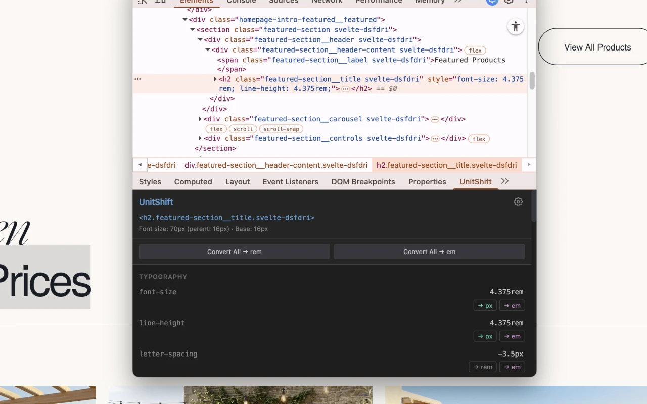
Why Pixels Are Still Breaking the Web in 2026
The pixel problem runs deeper than inconvenience. Hardcoded `px` values actively harm accessibility, responsive behavior, and search performance. Despite years of advocacy from the W3C and accessibility experts, absolute units still dominate modern CSS output.
The HTTP Archive Web Almanac analyzed over 17 million websites and found that the vast majority fail fundamental WCAG guidelines. Fixed pixel values are a primary contributor. The State of CSS 2024 survey confirms the same reality: developers remain locked into pixel-perfect, static mental models because `px` feels predictable.
WCAG Compliance Isn't Optional
WCAG 2.1 Success Criterion 1.4.4 requires that text can be resized up to 200% without loss of content or functionality. When you hardcode `font-size: 16px`, you override the user's browser settings. Visually impaired users who've configured their browser for larger text get nothing. Their accessibility preference is silently crushed by your CSS declaration.
It gets worse with layout. Hardcode a container at `height: 250px` and when text scales to 200%, it overflows or clips. Use `overflow: hidden` and the content simply vanishes. These aren't edge cases. WCAG documents them as explicit failures (F69 for clipping, F94 for viewport locking, F80 for form controls).
For anyone building responsive websites optimized for SEO, this isn't academic. Google's Core Web Vitals directly penalize layout shifts caused by rigid pixel declarations. Accessibility and search rankings are the same problem.The Letter-Spacing Trap Nobody Talks About
Here's a subtler failure that catches even senior developers. You set `letter-spacing: 2px` on a headline. Looks perfect on desktop. On mobile, the font size drops but the letter spacing stays fixed at 2px. The characters crowd together or spread awkwardly. The typographic rhythm breaks.
The fix is `em`. When you set `letter-spacing: 0.05em`, the tracking scales proportionally with the font size. Always. Across every breakpoint. The W3C ACT Rules for WCAG 1.4.12 specifically test whether letter-spacing achieves at least 0.12 times the font size. That's mathematically guaranteed with `em`, brittle and unreliable with `px`.
Why AI and Figma Keep Generating Rigid Pixels
The pixel problem isn't getting better. It's accelerating. AI code generators and design-to-code pipelines are flooding codebases with hardcoded absolute values faster than developers can convert them.
Figma operates on an absolute coordinate system. Every element is positioned with precise pixel X/Y coordinates. When Dev Mode exports CSS, it outputs `px` by default because that's what the canvas renders. The Figma community forums are full of frustrated developers requesting native rem conversion in Inspect. Years later, it remains unresolved.
AI makes it worse. When tools like GitHub Copilot, v0.dev, or Builder.io's Visual Copilot ingest a Figma design, they inherit the rigid pixel grid. Large language models trained on legacy codebases default to `px` because that's what dominates the training data. They lack the relational context to output fluid `rem` or `em` values confidently.
The result: AI generates layouts that look pixel-perfect at one screen width and break everywhere else. Developers then spend hours manually converting every value. This is the exact friction bespoke web development solves by building fluid systems from the start. But even in custom workflows, the raw conversion step remains tedious.The Context-Switching Problem Every Developer Faces
Before UnitShift, your options for CSS unit conversion were grim.
External web calculators like nekocalc.com or cssunitconverter.vercel.app require you to leave DevTools, open a tab, enter a value, copy the result, navigate back to your code, and paste. For every single property. The cognitive flow is shattered.
IDE extensions like VS Code's Unit Converter do simple regex text replacement. They have zero awareness of the live DOM. They can't read the computed font size of a parent element, which means they can't accurately calculate `em` values for contextual spacing.
Native DevTools offers nothing. Chrome DevTools has no built-in CSS unit conversion feature. Neither does Firefox. The capability simply doesn't exist in the browser natively.
The market was saturated with context-switching tools and completely empty of browser-native solutions. As someone who regularly builds tools as a web developer, this gap was begging to be filled.What UnitShift Actually Does
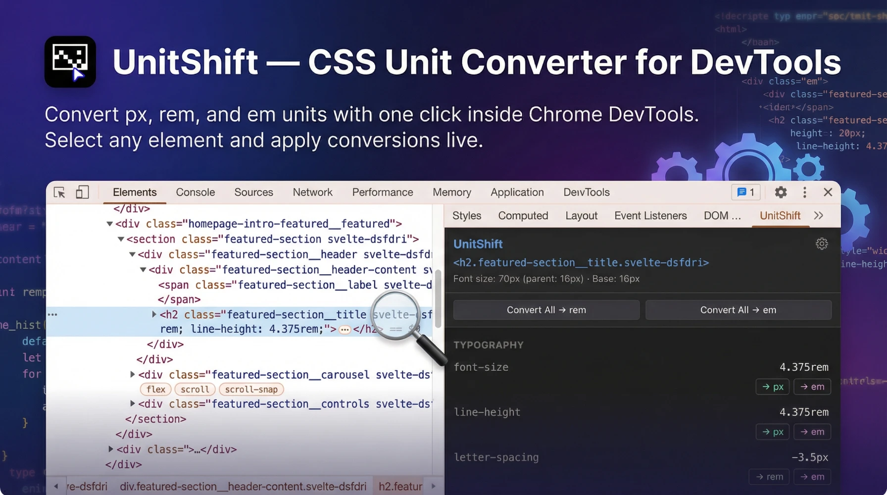
UnitShift is a DevTools sidebar panel for Chrome and Firefox. It reads the computed CSS of whatever element you're inspecting, converts values between px, rem, and em, and applies them as live inline styles directly on the DOM. No context switching. No calculators. No copy-paste gymnastics.
Context-aware em computation. This is what separates UnitShift from every calculator on the internet. When converting `margin-top: 48px` to `em`, UnitShift reads the actual computed font size of the parent element, not a static 16px assumption. If the parent renders at 24px, UnitShift correctly outputs `2em`, not `3em`. Every other tool gets this wrong.
Live DOM preview. Converted values apply instantly as inline styles on the inspected element. You see the layout impact in real-time without touching your IDE. Hate the result? Undo. Like it? Copy the value into your codebase.
Bulk conversion. Select multiple properties and convert them all at once. When you're cleaning up an AI-generated component with 20 pixel declarations, this turns a 15-minute chore into a 30-second operation.
Lightweight architecture. The entire extension is 13.84 KiB. No bloat. No tracking. No premium tiers. Free on both Chrome Web Store and Firefox Add-ons.How I Built It with Claude Code
Why Browser Extensions Are Deceptively Complex
Building a Chrome DevTools sidebar extension isn't a weekend tutorial project. Manifest V3 enforces strict isolation between background service workers, content scripts, and the DevTools panel. Getting a sidebar to securely read computed CSS from the inspected DOM, perform calculations, and inject converted values back requires managing complex asynchronous message-passing across multiple execution contexts.
Traditionally, just scaffolding this architecture took days of API documentation diving and cross-browser debugging before you could write a single line of conversion logic.
The AI Development Shortcut
Claude Code operates directly in the terminal with full filesystem access. I described the exact behavior I needed: "Build a Chrome and Firefox DevTools sidebar extension that reads computed CSS properties of the inspected element, converts px values to rem and em with context-aware parent font-size computation, and applies converted values as live inline styles." Claude Code generated the Manifest V3 boilerplate, the secure message-passing channels, the DOM manipulation logic, and the conversion algorithms.
The result is what happens when a practitioner who feels the pain daily drives the AI. Not a product manager guessing at features. A developer who lives in DevTools building the tool he actually needs. This is the same engineering approach I bring to every outsourced web development project: precise tooling, zero waste.Where UnitShift Fits in the AI-to-Code Pipeline
The modern front-end workflow looks like this: design in Figma, generate code with AI, then spend hours manually fixing every absolute pixel value. UnitShift compresses that last step from hours to minutes.
For teams evaluating custom websites versus templates, this distinction matters. Template sites ship with hardcoded pixel values baked into uneditable CSS. Custom builds start with fluid relative units from day one. UnitShift bridges the gap for developers transitioning between the two. In regulated sectors like healthcare website design, failing WCAG 1.4.4 due to rigid pixel typography isn't just a UX problem. It's a compliance liability. UnitShift makes rem/em conversion so frictionless that there's no excuse to leave inaccessible pixel values in production. Whether you're choosing between an agency or a freelancer, ask about their CSS unit practices. Developers who use relative units and browser-native tooling deliver code that scales. Developers who ship hardcoded pixels deliver technical debt.


Transform your website into a revenue-generating asset
Partner with an award-winning web designer and web developer from the Philippines, delivering world-class websites to global brands. 15+ years of experience creating sites that convert visitors into customers.
Frequently Asked Questions
-
Yes. UnitShift is completely free on both the Chrome Web Store and Firefox Add-ons. No premium tiers, no feature gating. I built it to solve my own daily workflow friction and published it because every front-end developer faces the same problem.
-
Yes. UnitShift is published and approved on both the Chrome Web Store and Firefox Add-ons marketplace. The functionality is identical across both browsers.
-
Calculator websites require you to leave DevTools, switch tabs, enter values, copy results, and paste them into your code. UnitShift operates directly inside DevTools as a sidebar panel. It reads the live computed CSS of the element you're inspecting and applies converted values instantly on the DOM. Zero context switching.
-
Most calculators divide by 16 (the default root font size) for every conversion. But `em` values are computed relative to the parent element's font size, which is rarely 16px in real layouts. UnitShift reads the actual computed parent font size from the live DOM and calculates the correct em value accordingly.
-
Yes. UnitShift supports bulk conversion. Select multiple CSS properties on the inspected element and convert them all simultaneously. This is critical when cleaning up AI-generated components that ship with dozens of hardcoded pixel values.
-
No. UnitShift applies converted values as inline styles on the live DOM for instant preview. Your source files remain untouched. Once you confirm the converted value looks correct, you manually update your codebase. This non-destructive approach means you can experiment freely without risk.
-
Rem values scale with the user's browser font-size settings, which is a core WCAG 2.1 accessibility requirement. Pixels override user preferences, breaking text scaling for visually impaired users. Rem also creates more maintainable, responsive layouts that adapt to different screen sizes without media query hacks.
-
Yes. I used Anthropic's Claude Code to develop the Manifest V3 architecture, message-passing channels, and DOM manipulation logic. As a Filipino web designer and developer with 15 years of experience, I defined exactly what the tool needed to do. Claude Code translated that domain expertise into working browser extension code.